

Just because I know how to use a hammer and nails doesn’t mean I can build myself a house. Sure, I may be able to craft a perfectly adequate birdhouse, but definitely not a house where my family would live.
As a professional graphic designer, I bring out my hammer-and-nails quip when I get frustrated by the proliferation of images gaining steam with the recent tech trend of do-it-yourself design platforms. With drag-and-drop artwork and a multitude of pre-loaded fonts and templates, someone with little to no design skill can create a piece of artwork.
Obviously, these are great tools for content marketers who may not have the budget or time to bring in a designer for a project. But I harken back to a quote from CMI’s Chief Strategist Robert Rose, “A chainsaw in my hands has a very different purpose and effect than a chainsaw in a professional’s hands.”
There’s something missing from many of these DIY-created images. What is it?
Allow me to quote the “mostly dead” Westley from one of the CMI staff’s favorite films – The Princess Bride (yes, we quote it quite often): “True love.”
True love, in the sense of what designers bring to their visual creation in the form of creativity, hierarchy, design rules, and attention to detail that gives their design a bigger impact over others clogging the audience’s news feeds.
Learn the rules
To their credit, DIY design platforms offer an abundance of blogs and tutorials on how to use their tools. Many of their posts focus on the do’s and don’ts of graphic design – the design rules to follow (or not to break). But, one thing I have learned in my years in the profession is that while design evolves and you need to learn though trial and error, good design is always grounded in the rules. I still (hazily) recall my college days, sitting in all of those design courses where we would endlessly critique the positive use of negative space, proper font treatments, and the dreaded trapped white space. We studied the color wheel for hours. We learned proportion and hierarchy.
For most of us, those lessons became inherent rules that we now follow from the start of a project. Allow me to show you an example of DIY artwork where the creator didn’t understand some of the basic design rules:
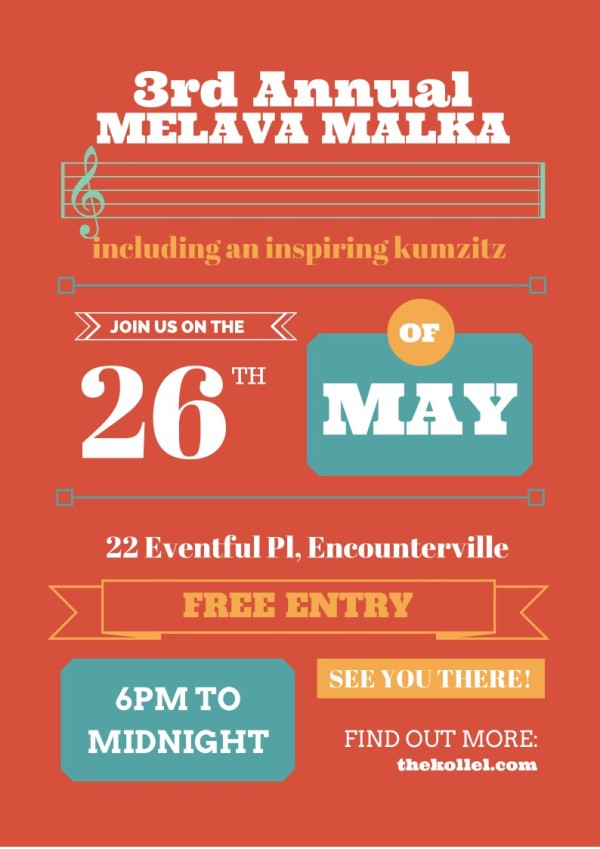
I pulled this example from a blog dedicated to the ease of use of DIY design programs. To me, it’s obvious that the blogger who created this particular graphic didn’t understand (or follow) some of the rules, including:
- Colors: I counted four. They are not particularly bad, but the way they are used seems disjointed.
- Fonts: I counted four. That’s way too many for such a piece, especially when used so randomly.
- Hierarchy: There is little use of hierarchy in this piece. It seems that everything carries the same weight and it’s causing my eyes to bounce all over the page searching for the pertinent information. Notice how the number 26 and the month of May are larger than the event name? The date isn’t what’s most important.
It’s a common mistake – DIYers are often so enchanted by the bells and whistles that they use too many of them and lose sight of the concept of the design.
It reminds me of the man in the Johnny Cash song, One Piece at a Time, who works at a Cadillac plant and steals one part every day for 30 years. He finally builds the “Cadillac,” but it looks nothing like a Cadillac. The man got so caught up in collecting the parts, he failed to recognize that he would have parts from 30 years and could never create a cohesive Cadillac model.
Taking the content from the example, I did a little revamp on it to show you the difference in use of fonts, color, and hierarchy.

See the difference? The reason I did this was to show you that ease of use doesn’t always guarantee best results, but following the rules of design does. Among the improvements:
- Colors: I kept the same colors as the original, but notice how I used the light orange and aqua colors in more of an accent role?
- Fonts: I went from their use of four to using two. The unique difference in the weights of the fonts eliminates the need for any more typefaces.
- Hierarchy: Notice that the predominant image is the event name? The accompanying treble clef artwork is now tucked behind the name as an enhancement for the headline to make the viewer realize within seconds that this is a musical event. Also, notice that some of the copy has been trimmed and now it is basically the pertinent info, placed in a pattern that the eye can easily skim.
Get a critique
If your budget doesn’t allow for a complete concept-to-design project, consider getting a critique or hiring a designer to consult. If you really enjoy using your DIY platforms, but are maybe second-guessing some of your design decisions, a designer may be able to guide you in the right direction while allowing you to do the work.
At CMI, I am fortunate to work with a team that is pretty savvy when it comes to visual content. With that being said, I completely trust members of my team to occasionally pursue their own visuals, as I know that they have an eye for design. I often look at my job as a visual facilitator. For example, Clare McDermott, editor of Chief Content Officer magazine, has a keen sense for design. She knows what she likes, she appreciates great design, but she relies on the creative team to translate and expand on her fantastic ideas for the layouts of the magazine.
Here’s another example of a blogger creating a great visual on his own but calling on a pro for critique. Blogger and friend Buddy Scalera recently wrote a post, Conflict Is Story. He makes reference to zombies and found some great royalty-free artwork of a lady during a zombie walk that he wanted to use. Buddy needed to create a header image for the post so he used that image with a headline:

Buddy’s original example
After designing it, he reached out to me for my thoughts and I shared a few ideas. Instead of recreating the art himself, he asked me to take a stab at it.

Professionally revised example
Here’s how I reviewed and revised the image:
Challenge 1: The image background was distracting. The random people walking around took away from the fear-striking look of the zombie girl. The lines of the building masonry led my eye all over the place.
Solution 1: I cropped the image to remove the background and let zombie girl make direct eye contact with the viewer.
Challenge 2: The headline was competing with the image.
Solution 2: I placed the headline in its own block of color – a color sampled from the deep red blood on the zombie’s neck. I also matched the word “conflict” and subhead to the orange highlights in the zombie’s hair.
I picked an irreverent font for the headline and tilted it slightly to pull the viewers’ eyes back to the zombie.
Challenge 3: The blog site information was barely visible in the right bottom corner.
Solution 3: I featured Buddy’s name and website prominently, which is particularly important if the image is being shared on social channels.
Think about a pro
So you have a project in mind that will need some visual content. You ask, “Do I do it myself with one of the DIY platforms or do I call in a designer for the assist?”
Remember, hiring a professional designer for your visuals is not an all-or-nothing proposition. Consider these scenarios:
- Involve a professional designer in a large-scale project or series of posts where you want a cohesive brand look that not only stands out in a crowd but is easily understood by viewers.
- Hire a professional designer to create visual templates for frequency tactics (i.e., blog post headers) that can be easily updated by your team.
- Consult with a professional designer to review your portfolio of visuals and make suggestions that can be incorporated on a DIY basis or as your budget grows to accommodate professional services.
In our ultra-connected world, especially in the content community, I’ll bet that if you ask, someone knows a designer who can help. If you are having some issues, take a look at sites like UpWork.com, a community of freelancers who share their complete bios, skills, designs, and hourly rates.

Have fun storming the castle
Sure, there is definitely a place for the DIY design platforms in content marketing but, as a designer, I implore you to study up on your design rules before taking the leap and creating your own artwork. It’s so simple to fall into the world of easily recognizable, frequently used templates, and clip art, hoping to stand out and look unique. But, in actuality, these efforts really just get lost in news feeds.
Yes, some content marketers still may want to use the DIY platforms like a magic pill bought from Miracle Max. But you know it takes the combination of both the magic of the pill and that true love brought by a designer to really differentiate your visuals. Otherwise, the idea of standing out in the crowd? Inconceivable!
How to Get More Mileage Out of Your Visual Content
Want to learn more about visual content, get all the latest insight, tips, and more? Visit CMI’s visual content topic hub.
Cover image by Joseph Kalinowski/Content Marketing Institute
