 Email has been, and still remains, a top marketing channel. As mobile usage has grown in virtually every other aspect of the web, so too has it affected email content.
For example, over a six-month period in 2012, Litmus reported an 80 percent increase in email opens on mobile devices. It has also been found that 80.3 percent of mobile users do not tolerate or engage with email content that is not optimized for mobile viewing (up from 69.7 percent the previous year). Yet, many companies are failing to adapt to this changing consumer behavior. According to the eConsultancy report, just one-quarter optimize their emails for mobile, and only 6 percent integrate mobile marketing into their overall email marketing plans.
A major challenge to mobile email content optimization is a lack of mobile email standards. To those experienced in standard HTML email design, this does not come as a surprise. HTML email remains a journey back in time to the early days of web development. Layouts must be arranged with tables due to the outdated HTML rendering engines of some email clients, and CSS must be applied inline as many email clients will completely disregard any style declarations made in the <head> section of the document. But this doesn’t mean that there aren’t at least some updated guidelines for getting your brand’s email content viewed on mobile devices.
Before planning, writing, designing, or sending your next email, review these considerations for design, content, and campaign optimization strategies to improve user experience — regardless of their screen size.
Optimizing email content design
Use generous font sizes: Bigger fonts are better for email content. To make sure your message can be easily read, body copy should be set to at least 14 pts and headlines set to 22 pts. Also, keep in mind that any font smaller than 12 pts will be automatically resized to 12 pts on Apple devices, causing text to potentially wrap differently than anticipated, and email designs to possibly break.
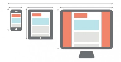
A single-column responsive layout works best: Traditional two-column emails are set at a width of 650 to 700 pixels (px), which displays well on desktop and most tablets. However, certain mobile operating systems (notably Android) will not scale email content to fit the screen (they use a standard median width of 480 px), and will therefore display only the left half of an email designed with a two-column layout.
However, when responsive design is applied to a two-column email, we get closer to an acceptable mobile-optimized email experience. Some email clients will respect media query functionality and stack sidebars and horizontal content into a single column, displaying beautifully on mobile. However, due to the overall lack of standardization, responsive design is not always uniformly accepted across all email clients, making a natively single-column layout with a maximum width of 640 px optimal.
Provide large CTAs in your email content: Your call to action (CTA) is the most important part of a marketing email. It should be eye-catching, well-placed, and — above all — usable. The criteria for creating a successful CTA vary, depending on whether it is to be selected by a cursor or a finger. Apple’s iOS Human Interface Guidelines recommend a minimum “tappable” target area of 44 × 44 px. That’s not to say that all buttons have to be 44 px, just that there shouldn’t be any buttons or links closer together than 44 px. Otherwise you run the risk of a “mistap.” Also, keep ergonomics in mind as you’re placing CTA buttons within your email content. For instance, they shouldn’t go in the lower right corner, where the user would find it uncomfortable to click.
Left-aligned text is preferred: Eye-tracking research suggests that western users focus the majority of their attention on the left-hand side of email content. This is hardly surprising since most of us read text from left to right. Also, from an ergonomic perspective, the majority of users will find it easiest to interact with elements in the bottom left/middle of their hand-held screen.
Optimizing email content
Keep subject lines succinct: The subject line is one of the email marketer’s most effective tools in an overcrowded inbox. Depending on the platform, you may have as few as 27 characters displayed for each subject line. Keep your subject line short and snappy, and front-end load it with the most important email content and a compelling reason to pay attention.
Consider using pre-headers: The pre-header is probably the biggest missed opportunity in mobile email optimization. A pre-header is the text that displays at the very top of your email. It is typically reserved for email content such as, “Click here for a printable version” or “Having trouble viewing this? Click Here.” What you might not realize is that this text will also display just below the subject line in a mobile inbox. It functions like a “Part 2” of your subject line, so your pre-header language should be given the same care and attention that you apply to crafting your subject line. Consider using copy that you’d like to include in the actual subject line — if you had the extra space.
Always use clear, concise email content: Think about the environment your email is being viewed in, and the screen size on which it will likely be viewed. Overall screen size is small when it comes to consuming email content on a mobile device, and consumers are more likely to be multitasking when they get your message on mobile. It’s more important now than ever to engage the user as efficiently as possible; limit the amount of copy you include, and make sure it is easily scannable by using headers, bullet points, and short paragraphs of text whenever possible.
Create a vertical hierarchy: Although there is much debate on the idea and importance of “the fold,” diminished screen real estate places more credence than ever on the significance of vertical hierarchy. Significant CTAs should be placed as close to the top of your message as possible. If they are not immediately evident, there is a greater chance they will not be seen or used at all.
Take care with your use of images: Don’t assume that your images will be able to be viewed when users access your content on mobile. For example, the iPhone’s native email app will display images by default, but many other mobile email clients won’t. Plan for an “images off” environment by making sure your message is still being clearly conveyed if it appears without any accompanying images. When you do use images, make sure they are bold and bright, with a single focal point and large (or no) accompanying text, as this will render best on mobile devices.
Consider including click-to-call capabilities: Placing a phone call will be easier than filling out a form for mobile users, so make it easy for readers to convert by using a native-mobile action like click-to-call. Include your phone number as a prominent CTA in plain text, or use a dedicated click-to-call button to do this within the email content.
Provide a plain-text version option: It is a general best practice for CAN-SPAM compliance to create text-only versions of your emails. This is also helpful when trying to reach customers using mobile devices that do not support HTML email — they will usually automatically revert to this plain text version in the reader (with active links).
Optimizing campaigns
Carefully plan delivery times: A study from Return Path found that mobile email use shows a fairly steady pattern through the week, but then starts to rise beginning on Thursday and continues to increase on Friday and Saturday before starting to taper off on Sunday. Monitor your own delivery analytics results to learn what days/times will be optimal for your customers.
Leverage geo-targeting capabilities: New technologies in mobile marketing can now empower you with information about customer location and purchasing patterns in real time. Data like these can help you to segment your email campaigns based on address and location to deliver targeted and relevant messages that can impact offline point-of-sale. Consider setting up email campaigns highlighting interesting offers in stores close to your customers’ homes. Or if they placed an online order, let them know if they can pick up their purchases in the brick-and-mortar store nearest to them.
Make it easy for readers to take the next step: Users are five times more likely to abandon a site when it’s not optimized for mobile. Once they’ve decided to engage with your business after engaging with your email content, make sure you don’t leave them hanging by forgetting to make your website mobile-friendly as well.
Summary
Thoroughly test all aspects of your email campaigns. Be sure that images load properly and quickly; that layouts are readable on any device or screen; that email content is clear, concise and scannable; and CTAs are easily actionable and “above the fold.”
Above all, always track how your customers interact with your marketing efforts, with special attention paid to mobile device usage. The data you have available should guide you in your optimization efforts, but it is almost guaranteed that mobile engagement will become more important and will improve with the integration of any or all of the above outlined mobile optimization efforts.
Looking for more ways to maximize the impact of your email content? Get practical insights, advice, and answers in our 2018 Guide to Essential Content Marketing Tactics.
