Updated Aug. 22, 2022
Open the best-converting page on your website on three devices – mobile, tablet, and desktop.
Really, do it. I’ll wait.
Does your content display as well as you expected it to?
Many marketers will find it doesn’t. The user experience and messaging consistency are unsatisfactory. Sometimes, it is downright awful.
How did you get here? After all, your company invests a lot of resources to publish content. You even maximize those content resources by adopting the COPE method – create once, publish everywhere.
And that may be the mistake.
Cheer up, fellow content marketer. I’m here to help with a slight adjustment – COPE-M.
A create once, publish everywhere strategy can be a mistake when it comes to visuals, says @BuddyScalera via @CMIContent. Click To TweetUnderstand why COPE-M is necessary
Using a traditional COPE strategy, you upload a chunk of content once (definition, image, description, etc.), and the CMS pulls (not pastes) that chunk into multiple deliverables. When you update the original content, the update ripples through your repository.
As a content strategy, COPE content is elegant. It’s efficient. It’s logical. It increases the reuse of your content and amortizes your investments in original content. It works with text, audio, and video.
But COPE is not a panacea for your content publishing. Modern browsers reflow your text, but images scale down for your devices. An image that looks great on a desktop may be unrecognizable on a mobile device. (Your audience doesn’t like that and neither does Google, which can hurt your content’s rankings.)
COPE is a great starting point, but a more layered approach to image control is necessary. I call it COPE-M – create once, publish everywhere mostly. COPE-M can be the bridge between a good user experience and a great one.
Create Once, Publish Everywhere Mostly (COPE-M) is a bridge between a good user experience and a great one, says @BuddyScalera via @CMIContent. Click To TweetAdopting a COPE-M approach to your content publishing strategy can spiff up your user experience, increase consistency, and improve your search engine optimization (SEO) with refreshed content.
Images aren’t necessarily best friends with COPE
A lot has changed since 2009 when Daniel Jacobson outlined the concept and technical approach to this content reuse strategy. COPE remains a solid concept, but today content is distributed through multiple device types. Audiences also consume the content in more formats.
Single-sourced text viewed in multiple browsers still works, but it’s a problem for images. Text can be separated from its appearance. Cascading style sheets enable the appearance of text, such as font sizes and column widths, to change without changing the original source.
Images are not as malleable. Rendered graphics (e.g., JPEG, PNG files) can’t be separated from their appearance. One size from a single source doesn’t always fit all. An infographic that looks good on a desktop may be unreadable on an iPhone. It leaves the viewer pinching, zooming, squinting, and grumbling trying to see it.
Images aren’t as malleable as text in coding, so a single-source visual doesn’t always look good across devices, says @BuddyScalera via @CMIContent. Click To TweetPick the images to multisource
Until content management systems get smart enough to automatically give ideal viewing experiences for every image on every device, you must consider when to COPE and when not to COPE with your images.
Go back to my original request – open your best converting page to see how it appears on multiple devices. Do that with the other important pages and images on your website. You probably already tagged them in your analytics software.
TIP: Narrow your page selection to those that get significant traffic from mobile devices.
To identify which images to multisource, test the selected pages on multiple devices. Grab a stack of devices and a designer, content strategist, or UX person. Load your content the way your customer would. If an image looks squished, add it to an images-to-be-multisource list.
TIP: Don’t just look to see if the image displays. Take a hard look at how it displays. If the user must pinch and zoom to view all of an image, COPE likely isn’t the best method.
Share the results with all content-related teams, including content strategy, design, content engineering, and user experience, who should know how your website’s images load.
Design for the multiple screens
With an image compromised on the high and low ends to fit a mobile device screen, it can be worthwhile to upload multiple images and tell the system at which breakpoint to use each one.
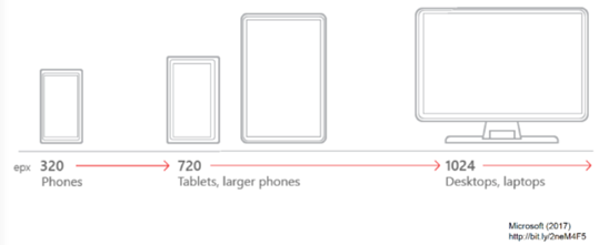
A breakpoint is a point at which the system stops pulling one image and pulls a version that’s a better fit for the viewing device. Breakpoints are determined by the device width because users can scroll vertically infinitely but can’t widen the screen.
This illustration shows three possible breakpoints: 320 pixels for a cell phone, 720 pixels for a tablet or large phone, and 1,024 pixels for a laptop:
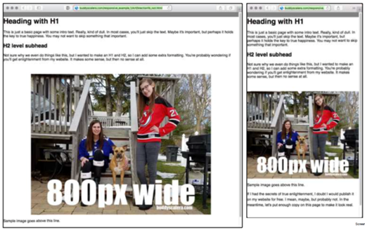
In this example, the original image of my two daughters and our dog is 800 pixels wide. It looks great on a desktop rendered at full size (left side of image). On a tablet-size screen, the original image loses detail, which diminishes its impact.
If this image were a chart or infographic, it might become illegible on a smaller screen. That’s why you should put extra effort into sourcing multiple images. This approach is called “responsive art direction.” It’s a browser trick that gives you a bit more control over the way images display to your users.
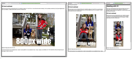
Here’s how that works with the original example. This time, I took different photos for each size – 800, 400, and 200 pixels wide. When published, their faces are approximately the same size in each.
In the 800-pixel horizontal version, one daughter sits on the stairs with our dog, while the other stands along the railing with a glimpse of the neighborhood in the background. In the 400-pixel vertical version, both daughters sit on the steps with the dog next to one of them with both railings visible. In the 200-pixel vertical version, each daughter and the dog have their own step, and only one railing is visible.
This approach isn’t COPE. It’s the not-mostly part of COPE-M. I created three times more work for myself. That’s why you should limit this time-intensive work to only the essential converting content.
See how multisource images get coded
While this article isn’t a tutorial on how to write this kind of code, you might find it useful to see what it looks like:

Between the “picture” tags, I specified the three source images, which are named based on the image width:
- jpg
- jpg
- jpg
Now, each image will kick in when it reaches its breakpoint:
- 499 pixels (max) for smartphones
- 799 pixels (max) for tablets
- 800 pixels (minimum) for desktop
Make COPE-M work for your brand
Most digital asset management (DAM) systems can create multiple outputs of a single image in different sizes and ratios. If you can’t reshoot the photos, crop them to ensure the best experience on all screen sizes. It can be a lot of work, so don’t ask your designers or developers to redesign every image on your website. Focus on impact.
If SEO is a top priority, check with your SEO specialists before implementing the multi-image approach. Google’s algorithm may penalize web pages that do not provide the exact same experience on desktop and mobile. Even though you are providing a better experience for humans, a Google crawler may not yet know this. Of course, if more people find your page worthy of their time because of a better image experience, Google will like that.
How about your team? Do you sometimes create multiple versions of your important images to accommodate a range of screen sizes? What have you learned from testing your images across multiple devices? Let me know in the comments.
HANDPICKED RELATED CONTENT:
Cover image by Joseph Kalinowski/Content Marketing Institute
