 Over the last decade, organizations have invested heavily in marketing analytics engines – from predictive analytics to performance management and data visualization tools. These tools help users surface insights from massive quantities of data, but perhaps more compelling, they bill themselves as “self-service” or accessible to marketers who may not have advanced quantitative skills.
Are those who are not data scientists or analysts equipped to make sense of the output from these powerful engines? Plenty of research points to the contrary.
Mynewsdesk surveyed 1,050 marketers, PR professionals, and business owners. (Disclosure: My company helped design the survey.) The results were eye-opening.
Just 18% of the respondents rated themselves as having a high degree of data literacy. (The average for marketers was only 19% — not significantly better.) Keep in mind, the definition of data literacy was about assessment of data presentations, not about data expertise: “Data literacy is the ability to extract meaning and insights from data. A person who is data literate is comfortable interpreting data graphics, analyzing and critiquing data presentations, and recognizing when data is being used to mislead.”
Just 19% of marketers rated themselves as having a high degree of #data literacy in @mynewsdesk #survey. Click To TweetTo reiterate, just one in five marketers say they’re comfortable interpreting data graphics, critiquing data presentations, and understanding when data is being used to deceive. These are numbers that need to be fixed.
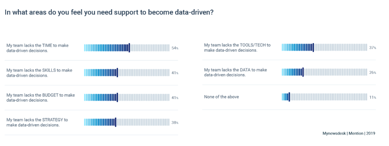
1 in 5 marketers are comfortable understanding when #data is used to deceive: @mynewsdesk #survey. Click To TweetAsked what prevented them from becoming more data-driven, respondents cited time (and it’s what always stands in the way). Lack of time ranked highest followed by lack of skills and budget. And it’s important to read between the lines what’s not being said. Most response options didn’t even merit half the votes, which amounts to a big fat “meh.” We can safely say becoming more data-driven simply isn’t a priority for many.
What this study shows is that while the availability and power of analytics tools are leaping forward, the teams deploying them may not have the skills to interpret the data-rich reports and visualizations produced. Not only are companies failing to extract full value from their data investments, in some cases they’re being led astray by misinterpreting findings.
Gartner predicted this growing gap – an explosion of analytics tools and a dearth of people who could use them proficiently – in early 2018. Carlie J. Idoine, a research director at Gartner, wrote, “If data and analytics leaders simply provide access to data and tools alone, self-service initiatives often don’t work out well. This is because the experience and skills of business users vary widely within individual organizations … Training, support, and onboarding processes are needed to help most self-service users produce meaningful output.”
What you need to know about data literacy
What can you and your brand do to address the issue? First, let’s unpack what I mean by data literacy as it applies to general marketing. I group marketing data literacy in three categories:
- Understanding basic statistics
- Knowing how to interrogate findings
- Visualizing data for transformation
Statistics
If you don’t feel confident about your math skills, I bet your challenge is statistics. As non-quant marketers we aren’t often called on to use college-level mathematics except when asked to do basic statistics. (God help me if someone were to call on my calculus skills.) Understanding statistics means getting the concepts and understanding how to pick apart research or statistics used at best incorrectly or at worst to deceive.
Interrogation
As important as it is to understand basic statistics (and how some people use statistics to elude the truth), it’s also critical to learn how to interrogate findings – how to poke holes in the data. All your fancy dashboards and summary reports do not arrive 100% complete.
You need to question what you see. Does it make sense? Is there a hidden factor influencing performance? What else could explain the change? What should you be tracking? Is something too good to be true?
Learn to patiently and methodically interrogate those beautiful reports produced by the technology you’ve invested in. For example, a common mistake I see is when companies publish research on year-over-year performance and ignore that the mix of respondents is different each year, which can dangerously skew results.
Visualization
Finally, take some time to brush up on your data visualizations skills. I wrote a bit about this last year. Understanding how to visualize data – to influence decision-making internally as well as to present information for an external audience – is a mission-critical skill for marketers.
Understanding how to visualize #data is a mission-critical skill for marketers, says @clare_mcd. Click To TweetEarlier this year I attended a conference at which a top executive at a large biotech company announced something along the lines of (paraphrasing): “We can’t hire data scientists fast enough to replace those being poached by competitors. Instead, we’re training people from within.” That company built a training program in which employees interested in data science could begin a career pivot – at the expense of their employer. Such is the demand for data skills in 2019.
Airbnb is doing the same thing with its Data University. The mission is to “empower every employee to make data-informed decisions.” The faculty is 55 volunteers who teach 20 courses each year. These classes equate to 100-level college classes and are tailored to team-specific needs. Since the program’s inception in 2016, 6,000 employees have taken 400 courses – and most have signed up for more than one class.
Jamie Stober, Airbnb data scientist, explains the power of Data University: “Post-training, employees on these teams built their own dashboards and developed localized solutions using data, which (the team in) data science never would have had the bandwidth to create. Participants in the program felt empowered to explore data on their own and use data tools to start measuring their work, which increased their impact and scale.”
The program’s benefits accrue not just for those who learn and use their new skills, it also frees time for in-demand employees. As Jamie writes, “When business partners can answer their own questions using basic SQL queries and dashboards, it frees up significant time for data scientists to work on higher impact projects which are crucial for the strategy and direction of their partner teams.”
Data education if you can’t attend a data university
Not every organization can build a data university, of course. What’s the solution for smaller budgets and less ambitious first steps?
I highly recommend Naked Statistics as a starting point. Charles Wheelan uses examples of data presentations from the news and business – good and bad – to teach about a range of concepts and trickery. It’s a great book for beginners but will also entertain data mavens.

Another classic is How to Lie With Statistics by Darrell Huff. (Published in 1993, it inspired the writing of Naked Statistics).

To learn about visualizing data, I recommend The Wall Street Journal’s Guide to Information Graphics. It’s a great primer on the do’s and don’ts of clear, simple visual design.

If you’re interested in more than the basics, Scott Berinato (editor at Harvard Business Review) published an excellent guide called Good Charts.

I also highly recommended: Storytelling with Data: A Data Visualization Guide for Business Professionals by Cole Nussbaumer Knaflic.

For those with the zeal to go further, consider whether learning to use Tableau (paid version) would benefit you. Tableau gives wings to your spreadsheet or SQL data. No longer are you locked into static presentations of data. Instead you can show up to meetings with interactive dashboards that can change on the fly … filtering, sorting, and even changing visualizations in real time. Incorporating this tool allows you to spend more time on probing the data and extracting insights, and less time on fiddling with colors and borders. (To read more about how Tableau works for organizations, read this REI case study. (Note: I have no commercial interest in Tableau except pure fandom.)
A tool such as @Tableau gives wings to your spreadsheet or SQL #data, says @clare_mcd. #dataviz Click To TweetIf you do nothing else to improve your data skills, you should pledge to never, ever confuse correlation and causation. That is the most common data mistake I see from marketers (and one you’ll be judged by). Just because two factors are correlated (e.g., cheese consumption and tangled bedsheets) does not mean one influences or causes the other.
The most common #data mistake marketers make is to confuse correlation & causation, says @clare_mcd. Click To Tweet
I share my data literacy knowledge and encourage you to expand your skills with the most profound humility. I’ve made some colossal errors. Once upon a time I worked as an accountant and let’s just say that on one inauspicious Tuesday in March 2004 I gave one unwitting employee a salary windfall by accident while doing payroll. (She had to give it back, sadly.) I am fully capable of dumb math, but by expanding my data literacy skills I’ve expanded my horizons in marketing and I encourage you to do the same.
Author Clare McDermott will speak on more mistakes to avoid in data at Content Marketing World this September. Register today to learn from her and over 100 other expert presenters. Use code BLOG100 to save $100.
Cover image by Joseph Kalinowski/Content Marketing Institute
Please note: All tools included in our blog posts are suggested by authors, not the CMI editorial team. No one post can provide all relevant tools in the space. Feel free to include additional tools in the comments (from your company or ones that you have used).
