You’ve got a responsive site with a kick-ass mobile design. You’re ready for Google’s “mobilegeddon,” right?
Wrong.
With all the excitement over Google’s upcoming mobile-friendly search-results update, marketers are neglecting one of the most critical features: copywriting.
Those focusing too much on mobile usability are giving short shrift to mobile copywriting. Content marketers must understand how and why mobile content matters, and how to create content that mobile readers will love.
Mobile copywriting. It’s a thing.
Smashing Magazine makes the provocative point that “you may be losing users if responsive web design is your only mobile strategy.” The Smashing contributor makes the point that under-the-hood coding is an integral part of the equation. I agree.
I would take his argument in a new direction. You also need to know how to write for mobile users.
How do you create mobile-optimized copy? Following are six critical lessons in the pursuit of better mobile content.
1. Forget everything you thought you knew about reading content online
It’s time to toss the old paradigms. Reading content from a mobile device is totally different from reading content on a desktop. Here are some of the things you’ll need to force out of your mind.
Golden triangle
The “golden triangle” is a viewing pattern in which web users primarily view the upper left corner of a website or search engine page results (SERPs). The principle is derived from eye-tracking studies, in which the majority of rapid eye movement covers a triangular region.
F-shaped pattern
Jakob Nielsen’s research on the golden triangle gave rise to the “F-shaped pattern” for viewing web content. This is another nugget of wisdom that, for mobile readers, is passé.
The F-shaped reading pattern taught that users looked at the top, left to right, down, left to right, and then down further. End. It made the shape of an “F” on eye-tracking studies.
This principle no longer applies in the era of mobile readers. There’s not enough screen real estate for horizontal sweeps and vertical movement.
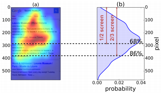
Instead, viewers look primarily at the center of the screen as indicated in this eye-tracking study from Briggsby.
As the image indicates, users give 68% of their time/attention to the center and top half, and a full 86% to the upper two-thirds. Anything below this point on the screen is less important.
Instead of clinging to a belief in the age-old wisdom of web readability, we need to redefine our perspective so we can create better content for the mobile revolution.
2. People view images more than they view text
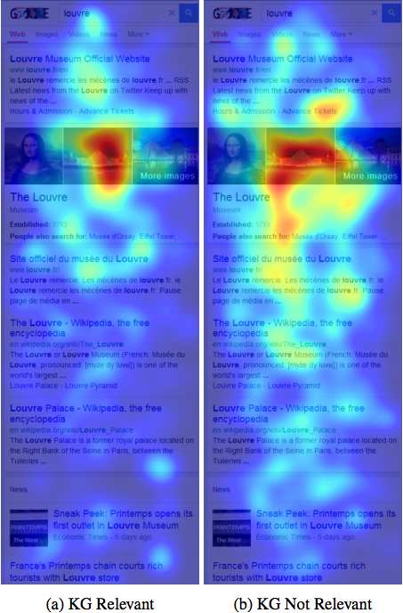
Eye-tracking studies indicate that mobile users look at images more than they look at text. Here’s a study to prove it. (Note: KG stands for Knowledge Graph – the entity results, panels, and carousel summary provided by Google.)
This image demonstrates that a user’s eye is drawn to images over text. Intent, query, content, relevance, and location are irrelevant to the principle that the human eye is drawn to images (source).
What’s the takeaway for copy? Use fewer images. They take up precious screen space. If the image doesn’t advance your point, don’t use it for mobile.
3. Get rid of unnecessary words, phrases, sentences, or points
The famous French polymath, Blaise Pascal, wrote, “I have made this longer than usual because I have not had time to make it shorter.”
His point? Concise writing takes time and hard work.
For mobile content, concise writing is essential. In this case, the necessity has more to do with the screen size than the user’s attention span. Your goal is to present the user with as much on-screen information as possible without requiring the user to swipe or tap. The more cogently you can express an idea, the better.
I do not recommend that you write shorter content. Long-form content is alive and well in an era of mobile content consumption.
Unfortunately, some mobile copywriters are advised to write less. This counsel is wrong. Longer content is still appropriate. Instead of shortening your content, tighten your writing.
Make your content as long or as short as it needs to be. Do not force yourself into some preconceived idea about what constitutes the right length of an article. Instead, wipe your article clean of anything that’s unnecessary.
4. Create short, strong headlines
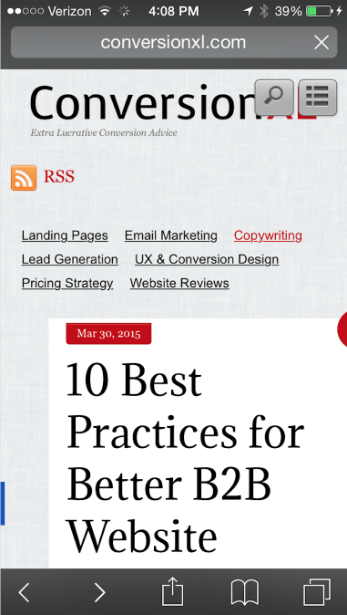
Your headline doesn’t need to take up several screens of space. Short and sweet are better. Why? Lengthy headlines get lost below the fold.
Short headlines are easily viewed in a quick scan.
Much of the responsibility for this, of course, rests with the designer. Mobile designers should realize that they don’t need to create monstrous titles on mobile devices. At the same time, you can help them (and readers) by condensing your titles to the essentials.
5. Front load your most powerful content
With desktop viewing, you have plenty of above-the-fold real estate. In some website designs, you can have four or five paragraphs visible – no scrolling required. Things are a bit tighter with mobile. For this reason, start your articles with a few attention-grabbing lines.
In this CMI article, I started with a few sentences crafted to attract the reader’s attention. These sentences previewed the content and pointed to a takeaway. Most importantly, the first sentence raised expectations and grabbed attention.
Whatever you do, don’t start out boring. What mobile readers see above the fold is what will compel them to read below the fold. Make it good.
6. Use short paragraphs
Readers tend to get lost in long paragraphs.
Cognitively, a viewer considers a paragraph to be a complete thought. If that thought is too long, then the reader will get impatient and move on.
Paragraphs also cause the eyes to move in a predictable and consistent rhythm through the article. A series of short, staccato paragraphs works somewhat like a cadence in a song – the reader keeps moving from paragraph to paragraph consistently and completely.
U.S. News explains, “Reading long paragraphs on your mobile device requires concentration – something people using a mobile device generally don’t have.” The solution? Write short paragraphs.
Long paragraphs work like speed bumps to derail the flow of the article. Nowhere is this truer than on mobile devices. An innocent five-sentence paragraph on desktop may not look all that intimidating, but it can easily turn into a wall of text on mobile.
Here’s a great example of a writer who uses short paragraphs to break up his content into readable chunks. It’s the perfect method for mobile.
Conclusion
What’s the secret to creating awesome mobile copy?
Don’t write less. Write better.
Mobile readers still read articles. In fact, they might read more content on their mobile devices. The time has come to realize that the mobile revolution doesn’t just affect viewports and require responsive tricks. It requires a reorientation to the art of writing.
How has the mobile revolution affected your writing style?
Looking for more ways to maximize the impact of your mobile content? Get practical insights, advice, and answers in our 2018 Guide to Essential Content Marketing Tactics.
Cover image by Joseph Kalinowski/Content Marketing Institute


