
Countless studies tell us infographics are highly engaging and that incorporating them into our content marketing strategy makes sense. But if the process for creating them is chaotic, the content is random, and the design guidelines are unclear, then each attempted infographic just eats up time and resources, and rarely delivers.
To successfully create memorable infographics that drive engagement, you need to stick to deadlines and keep up the momentum throughout their development. That requires a system to streamline the creation from start to finish.
That’s why you need to use infographic outlines.
Infographic outlines organize your content and optimize the design process. Good outlines ensure content quality, design quality, and improved turnaround. Effective outlines are the culmination of thorough research, organization, and planning.
Good outlines ensure better #infographics and improved turnaround time, says @jbear36. Click To TweetYour outline process will differ slightly depending on whether you’re using existing content or starting from scratch. I’ll walk through both approaches.
HANDPICKED RELATED CONTENT:
5 steps to go from nothing to the perfect infographic outline
You want to put together an infographic to publish in the next week or two. It needs to be original, informative, and entertaining. How you kick off this process directly impacts how the final product eventually performs. When starting from scratch, follow these five simple steps:
- Choose an interesting topic.
- Conduct research.
- Determine a data-collection method.
- Include titles, headers, subheaders, and general findings.
- Include design notes.
1. Choose an interesting and relevant topic
When deciding on a topic, think about your audience first. What can you create that is insightful, solves a problem, answers a question, or entertains your audience members?
In this example, NeoMam Studios created an infographic about why people like infographics (clever). It’s a great example of what a stunning infographic looks like, and the content itself is relevant to its audience of marketers, designers, content creators, etc.

To create an example for this post, I settled on an internal audience and something smaller scale but engaging in any workplace setting – the Netflix habits of our employees. It’s the kind of topic that really impacts office chemistry.
2. Conduct research
To gather the data about your topic, pick a research method, such as:
- Using Google search hacks
- Finding existing surveys or polls
- Conducting research
- Accessing academic sources
For the Netflix behavior topic, conducting research was necessary. I sent a survey to employees. It was easy to put together and took only a few days to get the results.
3. Collect and organize your data
With your research complete, it’s time to pull together the data you gathered.
I exported my Netflix survey data into a spreadsheet:
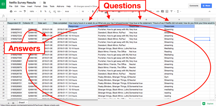
In a separate document, I listed each question and the volume of responses for each answer. I also included a tally of the qualitative responses to determine the most frequent answers.

With all the responses tallied, the body to the infographic outline was ready. Now it needed context.
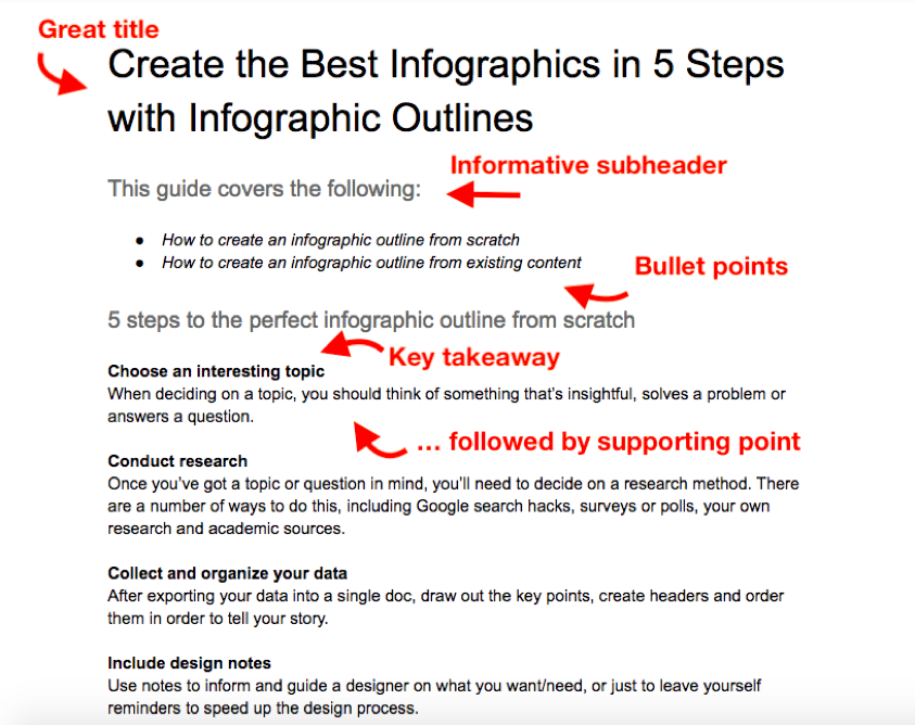
4. Use headers, subheaders, and general findings to provide context
An infographic isn’t a group of random statistics, it must tell a story – to explain what is being shared and why it’s relevant. All that should be detailed in your outline clear as day.
An #infographic isn't a group of random statistics. It must tell a story, says @jbear36. Click To TweetThis example of one of the worst infographics ever shared by Mammoth Infographics demonstrates the need for context.

It looks like an informative chart, but closer scrutiny offers no context, no insights, and no key takeaways. Not to mention, the percentages don’t add up, which is confusing and could have been clarified with a brief explanation.
Coming back to my Netflix survey infographics outline, I document clear titles, headers, and explanations so the audience understands the story I intended to tell:

I summarized the findings in words to reinforce the story that the data told, focusing on the most relevant facts.
While the outline is complete, there’s a final essential step – a few notes for the designer.
5. Include design notes
Design notes are critical because they help the artist better understand the intent of the infographic and get it done right the first time. These instructions help reduce (if not eliminate) the back-and-forth emails to figure out what’s needed, or worse, a final product you can’t use.
TIP: To avoid confusion between the notes and the infographic content, make the notes in the headers and footers of the outline.
Some standard design notes include:
- Preferred style: Refer to (link to example infographic)
- Inclusion of company logo: (link)
- Page format: landscape orientation, multi-pager
- Page dimensions: letter-size (8.5-inch by 11-inch)
For the Netflix survey infographic outline, those notes looked like this:

With clear notes, the designer can always come back to the outline to recall important points and details. After all, it might not be the only infographic that they’re working on.
Here’s how the Netflix outline and notes were translated into the infographic:

3 steps to create an infographic outline from existing content
You might have a great slide deck, an old blog post, or a section of a flyer that would look great as an infographic. The research is done. It’s quality information and it performed well so converting it into an infographic to get more out of it is a no-brainer.
It’s still important to create an outline specific to an infographic by following these steps:
- Identify key takeaways of the content.
- Determine title, headers, subheaders, and facts.
- Detail notes for the designer.
1. Identify key takeaways
What do you need your audience to remember? Even if they forget the awesome intro and all the anecdotes in the content, what should they leave with?
I transformed this blog post itself into an infographic outline.

Obviously, cramming all the text into an infographic would be a bad idea. However, with the right headers and bullet points, I can still get across the essential points of this post.
Once I reduce the existing content to the most important bits of information, I’m left with what will become my headers, key takeaways, and supporting points. Now I can arrange them accordingly.
Reduce original lengthy #content into the most important bits for a great infographic, says @jbear36. Click To Tweet2. Determine headers, subheaders, and facts
At this stage, finalize the content for the infographic. Once the outline goes to design, you shouldn’t need to add or delete anything for the infographic.
In my example, each header in the blog post became a major point in the infographic outline followed by a one- or two-sentence takeaway.
It may seem straightforward to summarize content, but this step allows you to drill down to the most essential points.
3. Include notes for designer
The role of notes for the design is the same whether you’re creating original content or working with existing content.
Conclusion
Don’t create infographics just because studies show they’re popular and effective. Create infographics because they are essential to your content marketing strategy and your team is well prepared to create highly effective infographics in an efficient manner. That requires a systematic approach. By creating clear and organized infographic outlines, you ensure content quality, a great design, and faster turnarounds, and get the most for your team’s time and effort.
Want to improve your content marketing programs with structured processes to create better efficiencies and more effective ROI? Make plans today to attend Intelligent Content Conference March 20-22 in Las Vegas. Register using code BLOG100 to save $100.
Cover image by Joseph Kalinowski/Content Marketing Institute
