
Let’s get right to the point. This article is gonna hurt.
Why?
Because this article is about the No. 1 mistake you and your business are making with what is still the most powerful online marketing tool there is – email.
You’ve heard the prognosticators: “Email is dead. Long live social media.”
Well, here’s the truth … they’re wrong.
In fact, according to a recent McKinsey & Company study, email is still a whopping 40 times more effective at acquiring customers than Facebook and Twitter combined. As the study points out:
91% of all U.S. consumers still use e-mail daily, and the rate at which e-mails prompt purchases is not only estimated to be at least three times that of social media, but the average order value is also 17% higher.
Email is anything but dead.
It is, however, changing and the problem is that the majority of businesses aren’t keeping up. Now sure, all the traditional stuff still matters. The No. 1 mistake you and your business are making is not crummy subject lines, spotty delivery schedules, weak calls-to-action, impersonal voices, lack of relevance or urgency, or even flat-out crappy copy.
No.
The No. 1 mistake you’re making with email is non-responsive design: Email that isn’t coded and optimized for mobile viewing across multiple screens and devices.
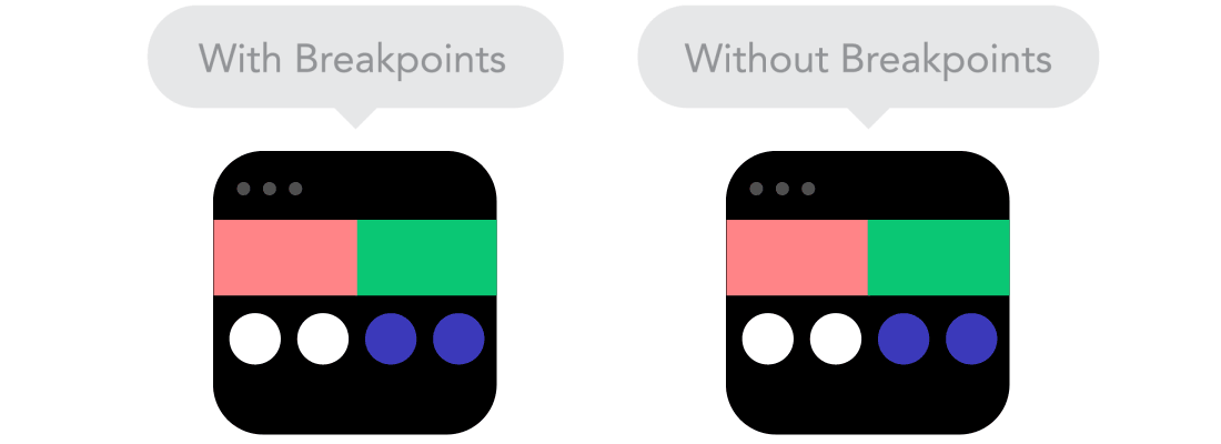
For a quick breakdown on what responsive design is, complete with animated GIFs illustrating the whole thing beautifully, check out Froont Blog’s 9 Basic Principles of Responsive Web Design. Here’s a great example to whet your appetite.
On the technical side of responsive design emails, complete with sample code, you can’t do much better than A List Apart’s Can Email Be Responsive?
For our purposes, however, what responsive email is isn’t nearly as important as why it matters.
Data to back the gravity of mobile-friendly email abounds. For instance, according to U.S. Consumer Device Preference Report: Q4 2013, 65% of all emails are now opened on a mobile device.
However, rather than re-crunch the numbers, let’s stick to the one that matters most: 42% of mobile users delete emails that don’t display on their devices correctly.
That means, the emails you send to four of every 10 email recipients might as well have the subject line (you guessed it): “Delete This Email!”
After all, that’s exactly what they’re doing. What’s an email marketer to do?
First off, get responsive. Lots of email providers offer responsive templates so there’s no reason to not start taking advantage of them immediately. However, be careful. Not all responsive email is created equal. Be sure that your provider allows you to test and preview your emails across a host of devices and platforms and it’s not just adjusting the font to fit each screen.
Second, steal. In other words, figure out who’s doing it right and what exactly they’re doing right. Then, rip it off. In that spirit, here are four of the best responsive emails and exactly what you should steal.
1. Smashing Magazine
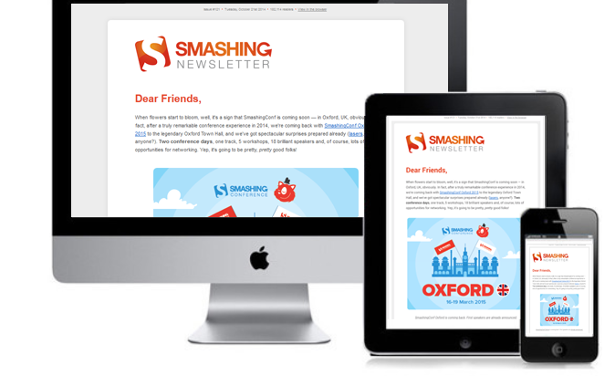
Steal this: Text-only table of contents
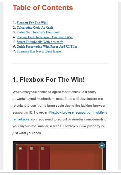
After an initial hero article, Smashing Magazine offers its readers a short, text-only table of contents. If you send out a single-column newsletter with multiple articles, this is a great way to allow your mobile readers to quickly skim the email’s contents and then select (i.e., click!) what’s most relevant to them.
Additionally, below the table of contents, Smashing Magazine includes responsive images and a brief synopsis of each article that automatically adjusts based on screen size:

2. Fast Company & JackThreads
Steal this: Responsive images
In a similar way (sans the TOC), Fast Company’s Co.DESIGN email and ecommerce hipster JackThreads both do a fantastic job of using multiple image-driven articles and products that display beautifully regardless of your device.
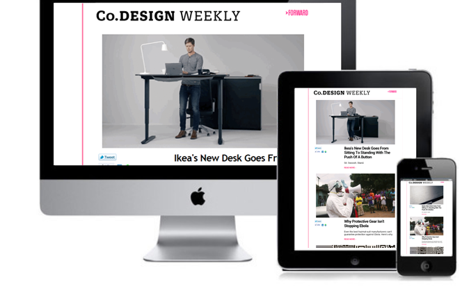
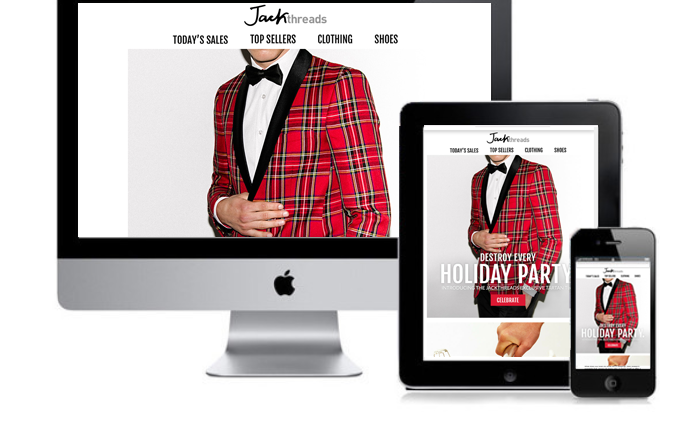
The power of responsive images is twofold. First, they look fabulous. Second, they take into consideration the slower internet speeds of most mobile devices. This is the same principle behind mobile-friendly websites. Automatically adjusting the size of images enables your recipients to download and view your email much faster. Again, be sure to read the fine print when picking a mobile-friendly template.
Because – in a world where 40% of people will abandon content if it takes more than three seconds to load – faster means more views and less deleting.
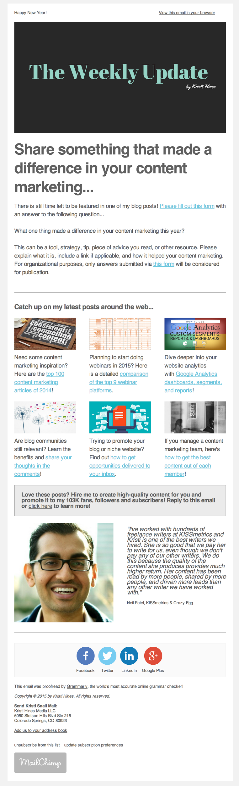
3. Kristi Hines (Copywriter)
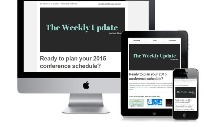 Steal this: Responsive layout
As is the case with our previous examples, copywriter extraordinaire Kristi Hines sends out links each week to multiple articles she’s written around the web. However, instead of a text-based table of contents, Hines takes full advantage of responsive design with a multi-column, image-based layout for desktops that automatically shifts to a single-column display on smaller screens.
In fact, this single-column approach was Rob Walling’s second “essential tip” for mobile friendly emails:
On a mobile-device screen, multiple columns typically appear condensed and confusing to navigate. A single column makes your email cross-device compatible and straightforward even when it’s viewed with different email clients.
For example, Hines’ email looks like this on your PC:
While on a phone, the same email displays like this:
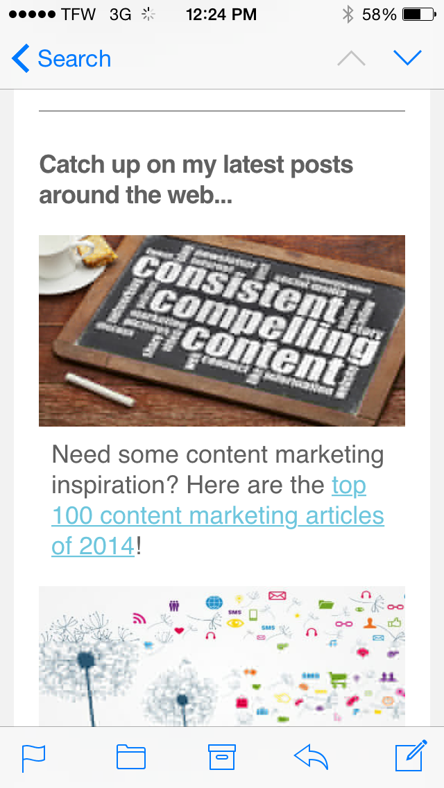
The benefit of this type of responsive design is twofold. First, it takes full advantage of what precious little real estate there is on mobile devices, and second, it refuses to sacrifice image quality on larger displays.
4. TED Talks
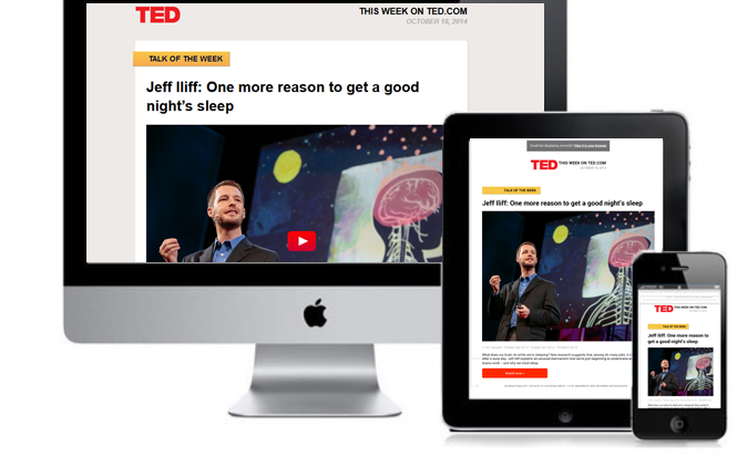
Steal this: Responsive CTAs
Unlike the previous examples, TED’s newsletter has only two possible clicks: a hero click – what it calls the “Talk of the Day” or “Talk of the Week” – and a safety click – a “Playlist” of the day or week based on the theme of the hero.
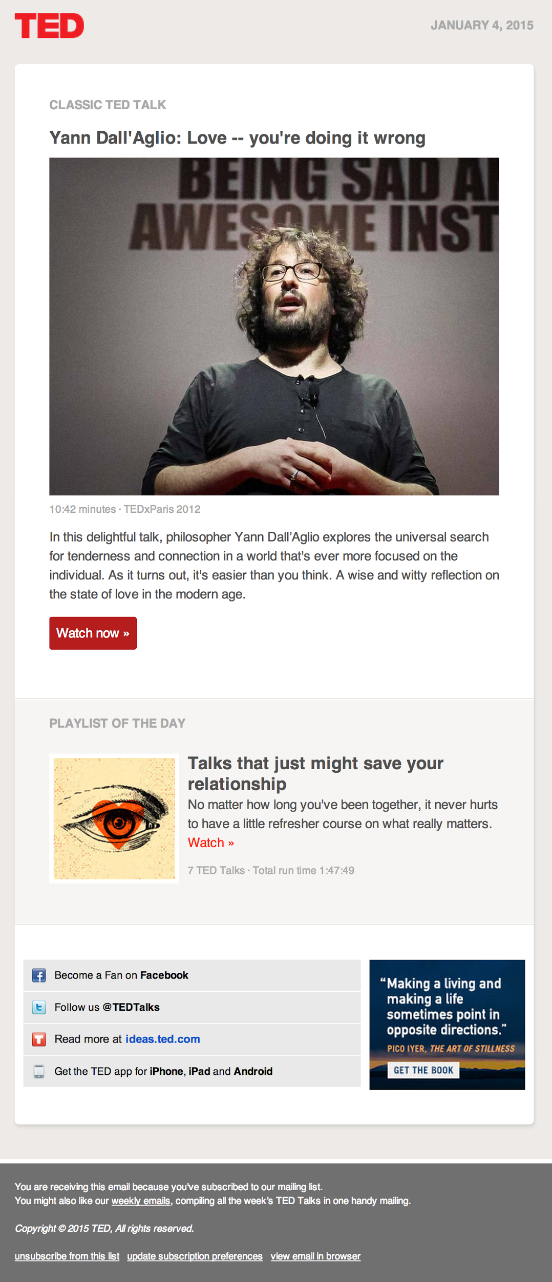
For both clicks, not only are the images responsive (as you can see from the displays above) but the calls-to-action are too. Here’s how one of TED’s emails comes across on desktops:
And this is how that same email appears on a phone:
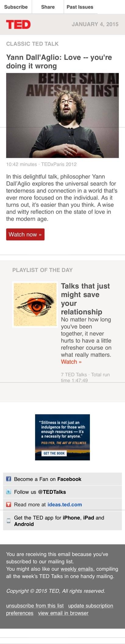
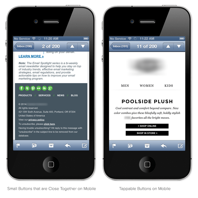
The thing to notice is that the CTA button remains proportional. It increases in size even as the overall display area shrinks. There’s also plenty of space around the CTA. This makes the most important part of the email – the click – easy to see and easy to tap on smaller, touch-screen devices.
This side-by-side comparison from HubSpot’s How to Optimize Your Emails for Mobile: A Beginner’s Guide illustrates the difference perfectly.
 So, let’s put this thievery together. Here’s what to steal:
- Text-only table of contents
- Responsive images
- Responsive layout
- Responsive CTAs
Now sure, all the examples above are beautiful. But don’t forget the real point: Mobile is the fastest-growing delivery method of what is still the most powerful online marketing tool there is.
And unless you want your subject lines to read “Delete This Email,” you’ve got to get responsive too.
Don’t miss out.
Want insights on how the most successful content marketers are using techniques like email, mobile content, and more? Read CMI’s eBook: Building the Perfect Content Marketing Mix: Internal Processes and Content Marketing Strategy Tactics.
Cover image by Kelseyannvere via pixabay.com
