In 2008, Walmart announced an ambitious store-remodeling program called Project Impact. It sought to increase sales by (among other things) significantly changing how products were organized and displayed. The project was a spectacular flop – with losses in the billions – and Walmart eventually reversed its methods.
Techniques of visual merchandising (i.e., displaying products to make them more appealing) can make or break brick-and-mortar retailers. Visual merchandising incorporates elements such as traffic flow, lighting, color, signage, product packaging, organization, and assortment. Good visual merchandising can have an outsized impact on sales – which is why retailers regularly change their store layouts and displays, or completely remodel their stores.
Content marketers can use visual-merchandising concepts to showcase their visual content more effectively – with as much as double-digit impact on page views, time on site, repeat visits, conversion, and social engagement. It also creates a better user experience and makes content offerings stand out in comparison to the competition.
Let’s look at some of the best visual merchandising techniques used by content marketers and online publishers.
1. Content packaging
Retailers know product packaging has a huge impact on sales. Good packaging grabs attention and communicates the value proposition of a product. When it comes to digital content experiences, every individual item of content should be similarly designed to entice the user. You should:
• Always use high-impact images
• Provide crisp and compelling titles and teaser descriptions
• Use badges (visual tags and symbols to call out specific categories)
• Ensure a clear call-to-action for every content item
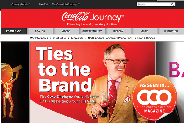
Visual Merchandising Example we love: Coke
Coca-Cola is a gold standard in content marketing destinations. We love how compelling titles are worked directly into high-impact images. Every piece has an accompanying descriptive teaser text and makes use of badging based on category. Every content-related element is clickable, with clear calls-to-action. For example, the use of play, read-now, and see-more buttons makes it clear to users what kind of content they can expect and what will happen next.
2. Content assortment
Endcap-aisle displays in a store are an effective technique to present items together in a visually appealing way, organized around a unifying theme, with highest margin items placed at eye-level. Items in endcaps typically outsell regular items by two (or more) to one. Similarly, for digital content experiences, how content is organized and presented can have a major impact on user engagement. You should:
• Group content into useful or interesting buckets
• Use visually appealing designs that are varied and make effective use of white space
• Take advantage of how users’ eyes scan a page
• Consider incorporating carousels or sliders – old standbys that remain effective for promoting content
Example we love: USA Today
USA Today recently went through a massive redesign and set the bar for rich, fluid, immersive news experiences on the web. We love the use of rich images, the variety of image sizes, text that appears when hovering over content, badging by category, eye-pleasing variation in sizing and assortment of articles, and logical groupings by category with curated and algorithmic groupings seamlessly integrated. USA Today also has created a fluid experience so users are able to navigate through content continuously – feeling almost like a native tablet application.

3. Flow
Retailers pay a lot of attention to traffic flow through a store. Are they drawing shoppers deeper into the store? Do displays and paths help move people through the store? User flow through digital content is equally important. You should:
• Always optimize for mobile
• Choose fast, fluid experiences (e.g., scrolling) over clicks wherever feasible
• Provide simple, compelling navigation and flat-content taxonomies
• Strive to bring more content directly to the users instead of expecting them to find it
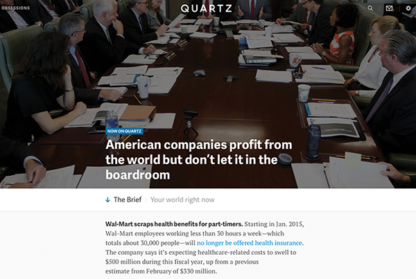
Example we love: Quartz
A rethinking of the content experience for users, Quartz is extremely mobile-friendly and features infinite scrolling and simple navigation, making it easy to keep reading and reading. Quartz is one of a new breed of content destinations that avoids clicks and layering of content in favor of a flat hierarchy that brings the user directly into its stories.
4. Cross-sell
Supermarkets put candy, soda, and magazines in the checkout line because cross-selling is an effective technique for visual merchandising. Content marketers also have big opportunities to suggest content most likely to keep a user engaged. You should:
• Use relevance, relatedness, recency, and popularity as key levers to merchandise content
• Make it extremely easy and timely for the users to select the next piece of content they want
• Personalize as much as your platform permits based on what you know about the user’s context, interests, and behavior (for example, don’t suggest content that the user has seen). Like the corner grocer who knows the name of every customer, the more you understand about your readers individually, the more effective you will be at promoting the best content for a user.
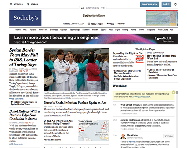
Example we love: The New York Times
The New York Times has been an early pioneer in personalized reader recommendations. We’ve found the recommendations to be quite good, and it must be working with their readers as they have been incorporating this excellent technology more deeply into the user experience.
American advertising icon Morris Hite summed up the opportunity for visual merchandising perfectly: “Advertising moves people toward goods; merchandising moves goods toward people.”
By delivering a visually engaging experience that makes interesting content easy to find (and hard to ignore), you increase the likelihood of your visitors consuming more of it. Retailers have long mastered this art, but we are still in the early innings when it comes to applying visual-merchandising techniques to content.
This article originally appeared in the December 2014 issue of Chief Content Officer. Sign up to receive your free subscription to our bi-monthly magazine.
Image courtesy of CCO magazine
