
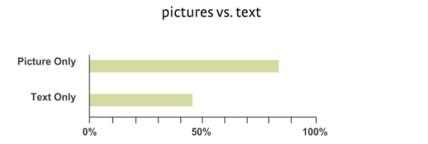
It’s no secret that visual content is powerful. Numerous studies show that our ability to recall information increases significantly when it’s presented as an image rather than plain text.
That’s why infographics, despite the fact that they are everywhere, are still effective when done well.
Infographics are still effective when done well says @sujanpatel. #contentmarketing Click To TweetWhat that means, as summarized by Jeff Bullas, is that an infographic (and visual content as a whole) should:
- Blend seamlessly into the user experience
- Fit the platform used to share it
- Offer genuine value — never an aggressive attempt to sell
- Be bite-sized — quick and easy to consume
- Relate to the things your audience cares about
- Be consistent in style and tone
Visual content isn’t going away. It always has played a critical role in marketing (and probably always will), as shown in these 11 examples.
HANDPICKED RELATED CONTENT:
1. One Day Without Shoes
TOMS’ #WithoutShoes campaign is designed to raise awareness of how an inability to afford or access shoes can affect a child’s quality of life, such as not being able to go to school.
Of course, TOMS is doing more than simply raising awareness. For each person who posts a unique image of bare feet with the hashtag #withoutshoes on Instagram on the designated day, TOMS donated a pair of shoes to a child.
Last year, more than 27,000 children in 10 countries received new shoes as a result of this campaign.

The success of this campaign is due to the stunning-yet-evocative user-generated imagery that makes viewers take notice while drawing attention to a worthy cause.
Purpose-Driven Content Marketing: Brands That Give and Get
2. Is a Barbie Body Possible?
Is a Barbie Body Possible? is a piece of visual content to accompany a lengthy post on Rehabs.com, an information and service referral source for people affected by substance abuse and behavioral addictions.
The article itself explores the media’s role in the prevalence of eating disorders in young girls. It’s a fascinating (yet scary) read that’s packed with sobering statistics. It’s also been linked to from more than 200 sites and shared more than 55,000 times.
Though the article is excellent, it wouldn’t have had the impact without the infographics.

Image source: Fractl and Rehabs
The graphic shows how Barbie’s vital stats measure up to those of the average American woman. The imagery is a natural accompaniment for the article. More importantly, the image boosts interest in sharing because the eye-catching content creates more questions than it answers. This increases its attractiveness because publishers can craft their own story around the visual content.
Of course, there’s much more to this content’s success than pretty visuals. It combines an instantly recognizable, often-controversial pop-culture icon and an issue that affects many.
In short, the graphics explore an emotional issue that we can all relate to in one way or another.
Your Guide to Creating and Sharing Content in 2016 [Infographic]
3. Domino’s emojis
Last year Domino’s launched an ingenious campaign designed to revolutionize the way people order pizza. To appeal to a younger generation, Domino’s allowed customers to text or tweet their orders.
That’s cool, but here’s the really interesting part: Customers don’t have to use words to order — they simply use emojis.
Emojis are a great example of the power of visual content. It’s easy for written communication to be misunderstood. Emojis (emoticons especially) help express the intent behind the words. They substitute facial expressions, which is vital to understanding.
Domino’s use of emojis goes beyond that. It shows that words aren’t really needed — visuals alone can express everything.
Words aren’t really needed; visuals alone can express everything says @sujanpatel. #visualcontent Click To TweetThe campaign makes perfect sense in an information-overloaded world in which the faster we can convey our message, the better.
It was also effective, earning huge amounts of media attention, with USA Today, Forbes, Good Morning America, and comedian Jimmy Fallon all picking up the story.
How to Craft Visual Content for a Mobile Audience
4. Movoto blog
Movoto’s real-estate blog shows the importance of two things:
- Visual content
- Repetition of a concept you know works
It’s packed with great content, but what really stands out for me is the blog’s category for novelty real estate. It takes buildings from popular culture and provides answers to pressing questions, like how much it would cost to buy them if they were real or how many Lego bricks it would take to build them.
Most articles in the series are accompanied by an infographic that provides context through illustration and explains how the final figure was calculated, such as this one about Harry Potter’s Hogwarts.

Image source: Fractl and Movoto
An article follows the infographic that adds credibility by explaining the calculations in finer detail.
Of course, while the information contained in the article is vital (without it, readers are just being fed figures without facts), it’s the infographic that’s key — simply because it makes the content so shareable.
The reality is that while some people crave all the facts, most of us prefer summaries in an easy-to-digest format. The combination used by Movoto satisfies both types of readers, while the infographic offers an additional benefit — it attracts links. The Hogwarts infographic secured links from Moz, PaperMag, and Pricey Pads.
5. Straight Outta Somewhere
In the lead-up to the release of NWA’s biopic movie Straight Outta Compton, Dr. Dre’s Beats brand partnered with Universal Pictures to design an interactive, digital campaign that wound up reaching more than 1.2 billion people.
The Straight Outta Somewhere campaign invited participants to celebrate their heritage by creating a personalized meme in the style of the movie’s title artwork.

More than 9 million memes were created, and not just by the general public. A number of big brands and even the White House got involved, with the White House staff creating this meme to promote the government’s nuclear deal with Iran:

The campaign shows how the impact of visual content can be amplified when you enable your audience to interact with it by personalizing the content in a manner that massages their own egos.
Are Your Customers Unsubscribing? 3 Ways to Deliver Delightful Content Experiences
6. Liking Isn’t Helping
Crisis Relief Singapore’s Liking Isn’t Helping campaign used a series of shocking images with Photoshop treatment to illustrate how “liking” a picture or taking “action” on social media in general doesn’t actually do anything to help the cause in question.

Liking or even sharing an image on social media does little, if anything, to help the cause charities are working toward.
Seeing a distressing image may trigger an emotional response but that isn’t enough, as the Liking Isn’t Helping campaign shows.
By visually representing something that so many people do every day — without considering whether it has an impact, this award-winning campaign gives its audience much more to think about.
Is Your Social Media Content as Popular as You Think?
7. Someecards
Someecards is the site behind satirical cards like these:


It’s a free service designed to poke fun at the average greeting card. In this case, the product is the marketing campaign. The cards are unique and entertaining in large part because they depict relatable everyday situations. They also show how basic visuals can transform content and how the simplest ideas can be the most successful.
Basic visuals can transform #content & the simplest ideas can be the most successful says @sujanpatel. Click To TweetWhen someecards launched in 2007, it was a service to send cards digitally. Here’s a (broken) shot of what the site looked like:

Today the site is populated with news and lifestyle content, and visitors create their own e-cards (identifiable by the “user card” stamp).

It also remains completely free; the site is monetized through ads.
The cards and their messages are brought to life by the understated illustrations. What’s clever is how the same illustrations can be replicated across multiple cards. It just goes to show how visual content doesn’t need to be elaborate to be effective.
8. Airbnb map
The Airbnb map is an interactive, real-time visual representation of where Airbnb guests are staying.

The content is visually stunning and fully immersive.
More to the point, it makes otherwise boring information interesting. A list of the volume and whereabouts of Airbnb rentals would be as dull as it can get. No one would care. Presenting the information as an interactive map, however, changes the game. Seeing where Airbnb rentals are happening (and where they aren’t) at a glance provides a unique perspective on the world. It shows where tourism is most and least prevalent and, in a way, manages to make viewers feel closer to the rest of the world.
Its effectiveness as link bait is proof of how the right visuals can transform how people absorb and respond to information. Majestic SEO, a tool that monitors various SEO signals, is reporting 169 links to the map page from 54 domains.

Interactive Content: The Good, Bad, and Wicked Cool Quizzes and Games
9. KLM Lost & Found
Dutch Airline KLM’s Lost & Found video is one of its most successful — at the time of this writing, it’s been viewed more than 22 million times.
That’s bound to have something to do with its star character — a beautiful little beagle — but there’s more to it than that. The video triggers an emotional response in its audience. It explores an issue most of us can relate to — losing important belongings while traveling — while managing to make us empathize with the employees who help reunite us with them.
That ability to evoke emotion in the audience is thanks to the video, which, while clearly low-budget, is well-made. The smiling employees, the happy customers, and of course the beagle all represent KLM’s message: that the airline is there for its customers, first and foremost.
10 Tips to Pack More Personality into Your Content
10. Elf Yourself
Office Depot’s seasonal Elf Yourself campaign is another example of how much more impactful visual content can be when it’s personalized to your audience.
For anyone who hasn’t come across Elf Yourself before, it’s essentially a tool that lets you create an interactive e-card that turns you and your friends into dancing elves.

I’m not entirely sure how Elf Yourself relates to Office Depot, but I don’t really think it matters. It’s great fun and satisfies our narcissistic side by making us the stars of the show.
It also ticks the boxes of being really easy to use and really easy to share. No wonder, then, that by the launch of the 2015 campaign, more than 1 billion elves had been created since its introduction in 2006.
Use of Interactive Content on the Rise [Research]
11. The Best Job in the World
To me, the bright blue waters, clear skies, and pure white sand of a tropical island beach are some of the most beautiful sights in the world. I know I’m far from alone in that, which is why imagery like this is sure to turn heads:
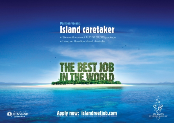
The Best Job in The World is a campaign designed by the Queensland Tourism Body to promote Hamilton Island in Australia by seeking an island caretaker.
The job was real and eventually filled by Brit Ben Southall who beat out almost 35,000 other applicants.
Of course, while the job was real, its promotion was all part of a wider marketing plan designed to drive tourists to this incredible part of the world.
Luckily for the Queensland Tourism Body, such a stunning destination sells itself, but it’s still a lesson in the importance of visual content: The campaign, which was successful in part on account of its breathtaking imagery, drove 7 million visitors to the site.
Conclusion
Visuals are vital in all forms of marketing. They help to capture and keep attention, and illustrate points more effectively, all while making content easier to share.
Visuals are most effective, however, when they trigger an emotional response. That might be happiness, anger, or empathy. Whatever it is, your goal should be to ensure that all your marketing campaigns are enhanced with visuals that help people to feel.
Visuals are most effective when they trigger an emotional response says @sujanpatel. Click To TweetWhat visual content have you found to be most effective? Share in the comments.
37+ Tips and Tools for Picture-Perfect Visual Content
Need more ideas on how to create killer visual content? Download our latest collection of amazing brand examples: Get Inspired: 75 (More) Content Marketing Examples
Cover image by Joseph Kalinowski/Content Marketing Institute
