
This post isn’t about quizzes. It’s not that we don’t live, love, and share quizzes. It’s that you already know they are wildly popular, hugely successful, and a must-do in your marketing plan. This piece focuses on interactive content beyond online test-taking.
1. Interactive white paper – the classic comes of (digital) age.
The white paper has been around since at least Winston Churchill (1922). B2B versions date back to the 1990s and, while I don’t know this, I would be willing to wager that Big Blue authored one of the first.
Fast forward to 2015: What has changed for the venerable white paper? The rise of creative talent has meant more visuals and illustrations. The rise of social media and text messages has meant shorter sentences, more white space, and lots of buzzwords.
In the desire to create the perception of something new and less staid, marketers stopped using the name “white paper” in favor of “guide,” “e-book,” and “workbook.” They added verbiage like “complete,” “definitive,” and “ultimate” to the titles to signal that (1) theirs is different (interesting) and (2) you won’t ever have to read another.
But, honestly, what has really changed? Today’s white papers could still be mimeographed and placed in your office mailbox next to the coffee machine. Except that your office doesn’t have a coffee machine – just a high-end European espresso maker – and you don’t have a physical mailbox.
Isn’t it time for the white paper to catch up?
White papers are great – we write them ourselves – but they also come with limitations. There are too many of them and marketers can’t tell who actually reads them. Download, yes, but read and consume? That’s a black hole.
What, then, does the modern white paper look like? It’s engaging; it’s multimedia; it’s interactive. The modern interactive white paper asks questions, provides benchmarking opportunities, and takes readers through a tailored experience based on the information they share. Questions, assessments, calculators, and videos can be incorporated, creating a truly personalized, effective piece of content that takes advantage of the power of digital and provides both marketers and consumers with targeted information. In full disclosure, here are a few examples from companies that use SnapApp, which is where I work:
- Infinio, a data-storage company, created a comprehensive interactive guide around trends in the data-storage industry and collects feedback on each point in its interactive white paper.

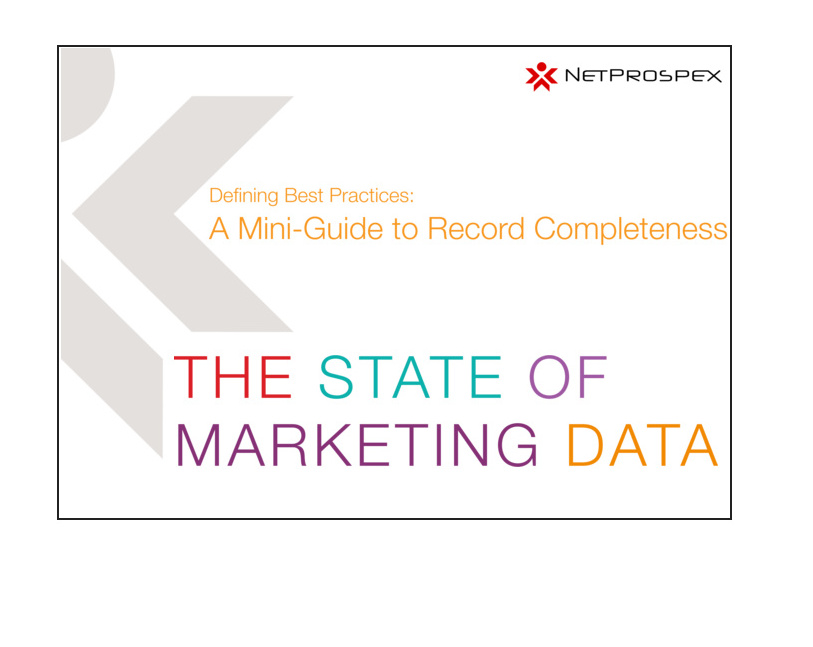
- NetProspex (Dun & Bradstreet), a B2B data and contact company, created an interactive white paper about record completeness. It leveraged an existing research report for the content and used the interactive white paper to generate new leads and increase downloads. It achieved a 52% click-through rate – plus the marketing team knows how each prospect answered each question. With high engagement rates and the opportunity to both share and collect information, why not take your latest white paper and make it interactive?
2. Interactive infographic: Content marketing nirvana?
Infographics are a great format for presenting conclusions learned from analyzing data. Almost 80% of marketers report sharing infographics sometimes or frequently, according to Demand Gen Report’s 2014 Content Preferences Survey. Not nearly as dated as the white paper? Think again. Infographics have been around since at least 1626 when Christoph Scheiner demonstrated the sun’s rotation patterns in Rosa Ursina sive Sol.

However, with infographics’ rise in popularity driven by higher click rates and easy-to-create software packages has come an increase in the number of infographics. In short, they are quickly becoming a victim of their own success. Plus, like the static white paper, they don’t address the download black-hole problem – are they really being reviewed?
How to improve an already successful format?
Go with an interactive infographic. Present the data. Ask the viewers to confirm if that data resonates with them. List challenges others have cited. Have the viewers rank their challenges. Can you use these interactive results to better qualify and nurture your leads? Maybe your sales team would love to get their hands on the list of the top three challenges noted by Joe Smith while he ate his bagel and interacted with your infographic.
An interactive infographic takes one of the most effective content marketing formats and makes it better by enabling two-way discourse between the brand and the recipient. This information then can be used to update the infographic itself and provide data for future conversations between the two parties. For example:
- Endicia, which offers online postage and shipping solutions, put together an engaging infographic on package returns showing how e-commerce companies can maximize efficiency and minimize costs.

- Bizo (LinkedIn), a B2B data-management and targeting-technology company, created an interactive infographic allowing users to navigate through a B2B buyer’s journey so that marketers could better understand the power of pull-versus-push marketing.

Is an infographic on your marketing horizon? Take it to the next level and make it interactive.
3. The calculator. Interactive and poised to move beyond mortgage payments.
Calculators are where infographics were a few years ago – a great idea but open only to the few brands that could afford to develop one. Long used by consumers trying to figure out how much house they can afford to buy, calculators are now possible in a whole new world because their creation no longer requires six months of coding. Calculators can tabulate:
- ROI on your trade show investment
- Cost of computer downtime
- Cost of employee and/or customer churn
- Cost of poor ad performance
The list of possibilities goes on and on.
Regardless of your industry or your department, chances are that before you are authorized to make an investment, you are asked to demonstrate its expected ROI. How do you go about this? Do you find it easy to pull together the data to prove your case? Providing prospects with an easy way to calculate your product’s ROI is a high-value, high-impact method. Here are a few examples:
- SilkRoad, a talent management company, offers an Onboarding ROI Calculator, which allows companies to calculate their annual investment in dollars in performance reviews. In the first months, SilkRoad achieved more than 250 new leads.

- Harte Hanks, a marketing services organization, provides a market-intelligence calculator that tabulates the value of missed opportunities. This single calculator boasted a 51% click-through rate.
Ultimately your job as a content marketer is to first get your audience’s attention, and then to keep it. With average click rates of 50% and lead conversion rates of 40%, interactive content might be just what you need to boost your lead gen in 2015.
Want to interact with the Content Marketing Institute? Sign up today to receive the CMI’s daily email and receive exclusive content from CMI Founder Joe Pulizzi.
Cover image by Viktor Hanacek, picjumbo, via pixabay.com
